
Back to Writing
The Role of the “Thumb Zone” in Mobile App Design
🇹🇷 Türkçe versiyonu için tıkla
Steve Jobs revolutionized the mobile phone industry when he introduced the first iPhone in 2007. This transformation not only impacted the industry but also fundamentally changed how we interact with our devices and our daily habits.
As of 2024, according to the United Nations, 6.925 billion people worldwide own a smartphone. You have likely encountered different usage scenarios while interacting with your phone.
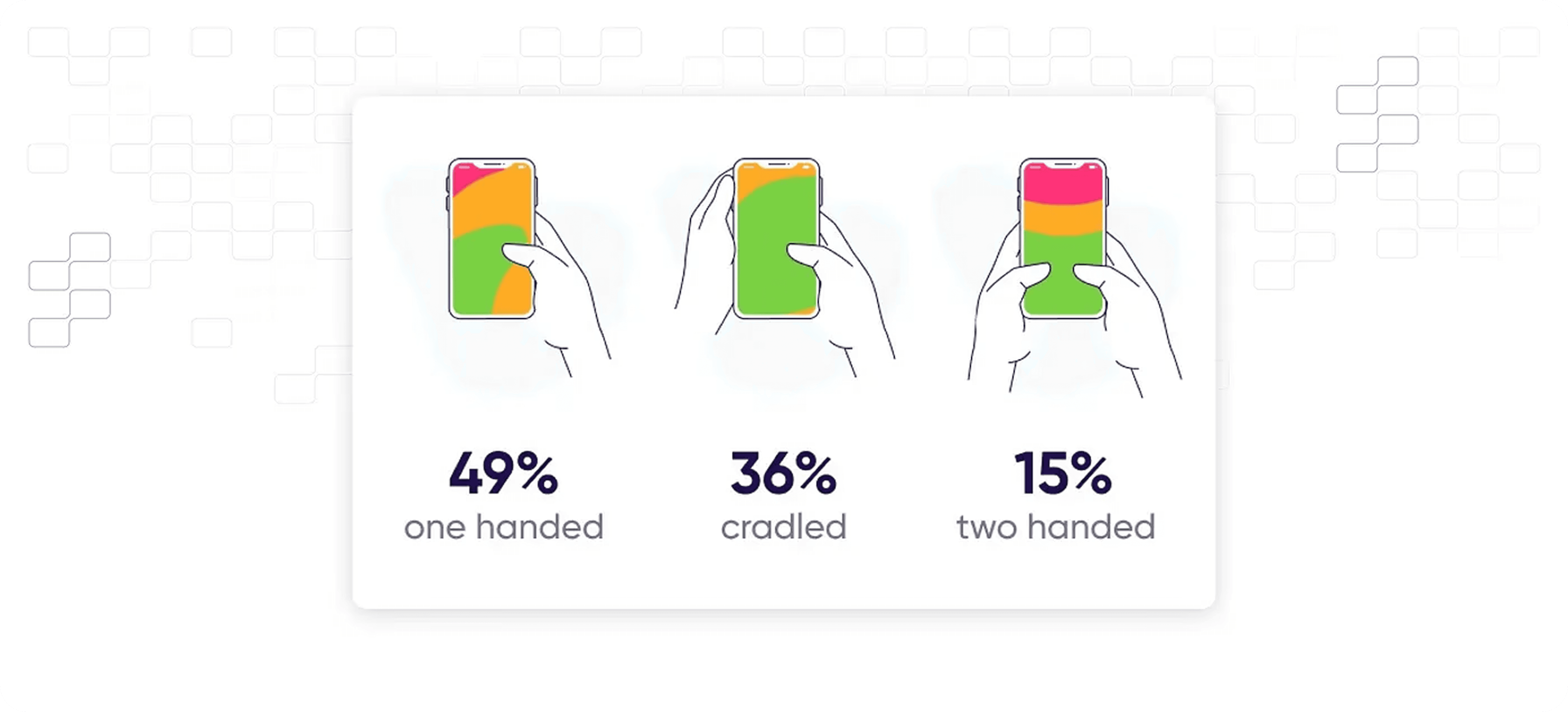
Different Ways of Holding a Smartphone
Like many others, 49% of users prefer using their smartphones with one hand, and 75% interact with the screen using a single finger. These statistics indicate that users do not always want to use both hands when performing actions on their devices.
What is the “Thumb Zone”? 👆
First introduced by Steven Hoober, the term “Thumb Zone” refers to the range of accessibility for a user’s thumb when interacting with a smartphone using one hand. It defines the areas that are easily reachable versus those that require additional effort.
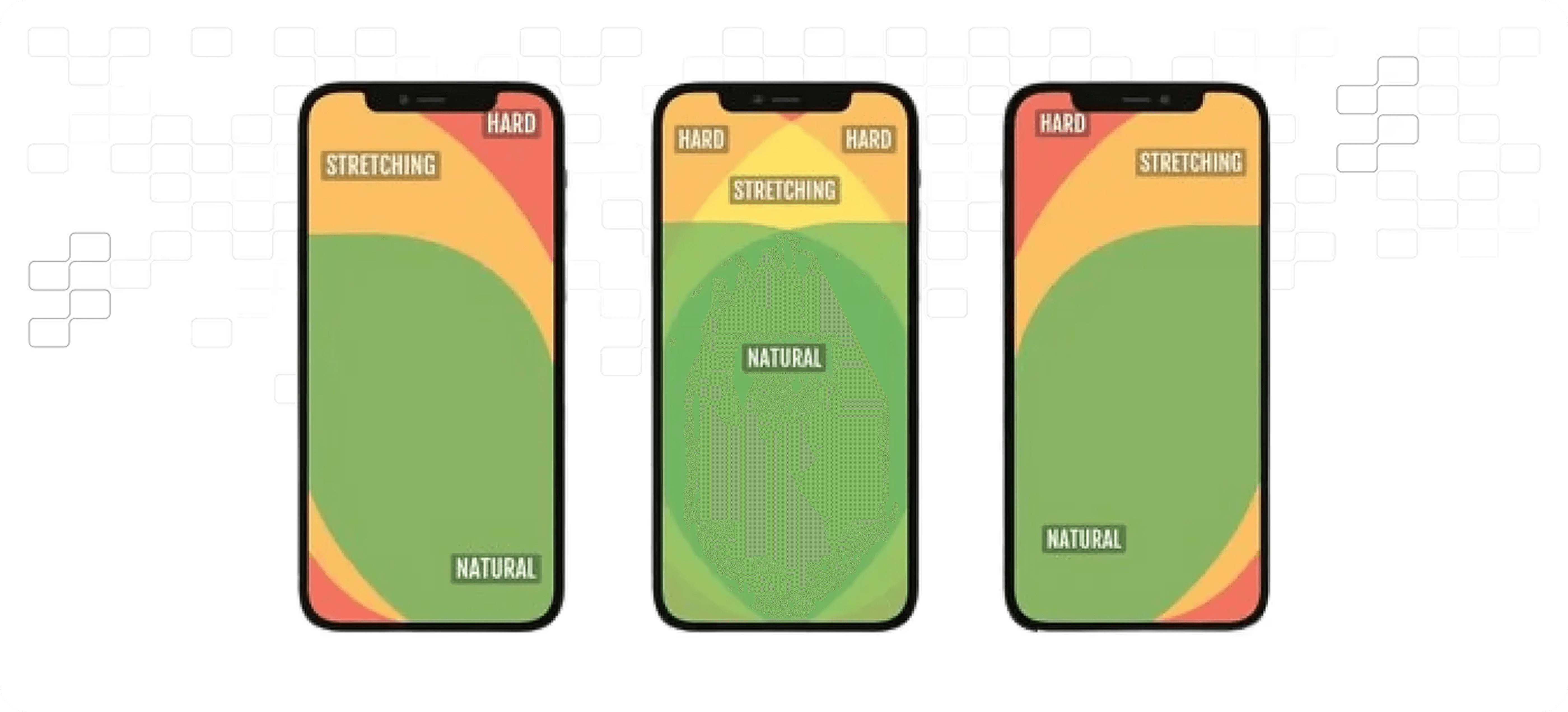
This concept is particularly relevant for large-screen smartphones and tablets, where one-handed use becomes challenging.
Evolution of Smartphone Screens and the Thumb Zone
When smartphone screens were smaller (5 inches or less), reaching most areas of the screen was relatively easy. However, with the rise of larger devices (above 5 inches), users must stretch their fingers further, which is not always feasible.
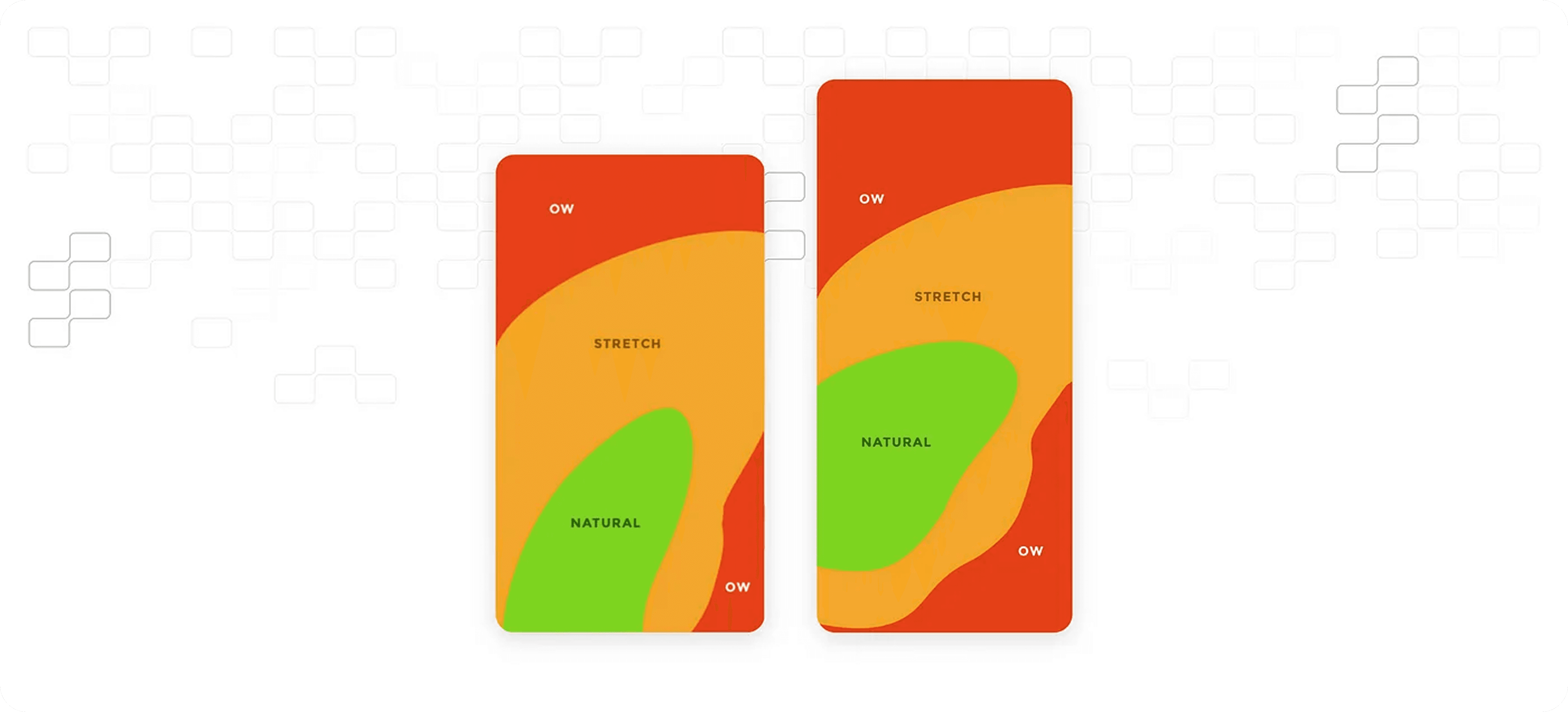
Especially when interacting with the middle and upper corners of the screen, users struggle to reach key buttons or functional areas. Therefore, designers should avoid placing frequently used buttons or essential features in the top-left or top-right corners.
Enhancing Accessibility and User Satisfaction
To improve usability and overall satisfaction, key interactive elements should be positioned within easy reach. Understanding and designing for the “Thumb Zone” is crucial for a seamless user experience.
Samsung One UI: A Case Study
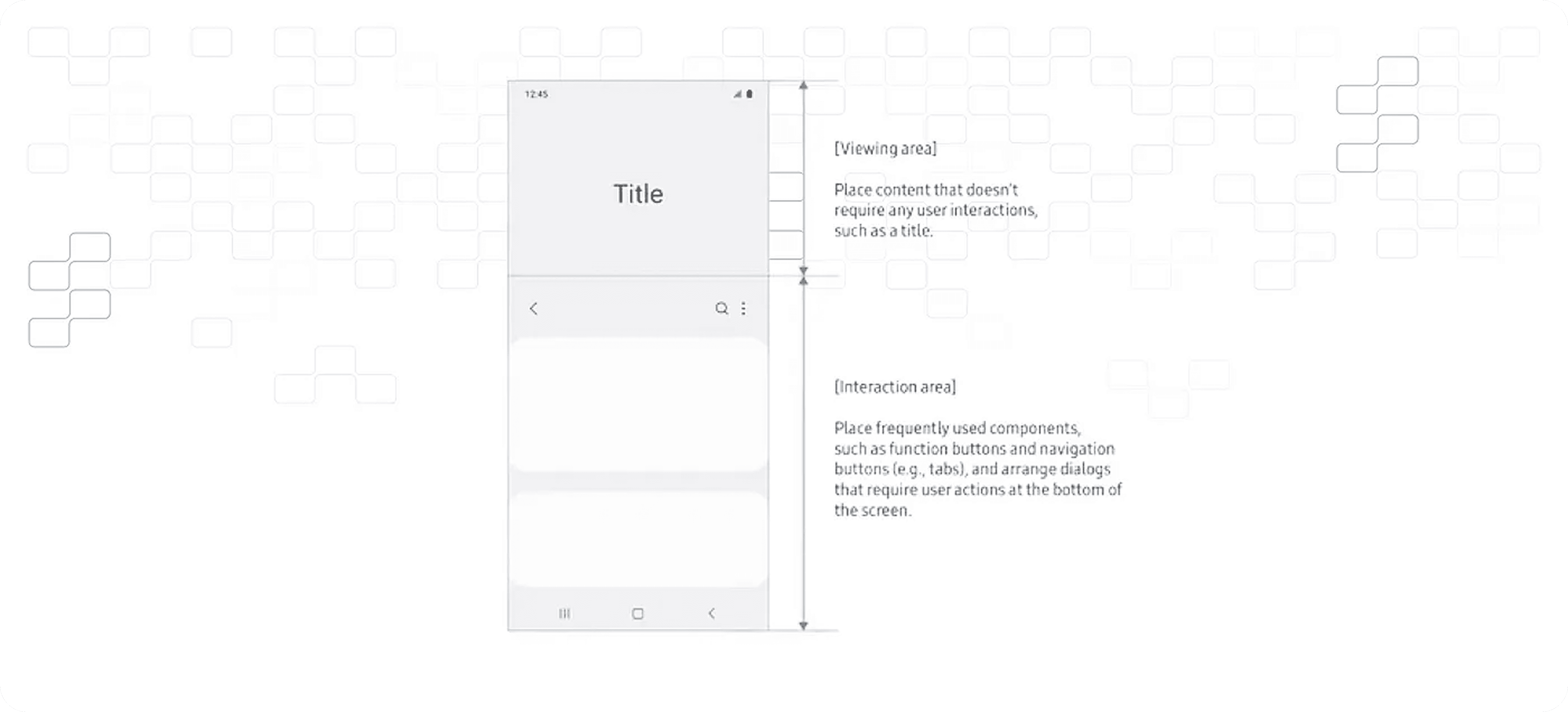
Samsung’s One UI presents an excellent example of effective thumb-friendly design. The interface is divided into two sections:
Viewing Area (40%): The upper portion of the screen, displaying non-interactive visual content.
Interaction Area (60%): The lower portion, containing interactive elements like buttons and navigation tools.
By relocating primary interactive elements closer to the user’s thumb, Samsung has significantly improved accessibility and usability.
Apple Maps vs. Google Maps: A Comparative Analysis

Apple Maps demonstrates an effective use of the “Thumb Zone.” Its key location-based search functions and quick-access buttons are placed within easy reach at the bottom of the screen.
Conversely, Google Maps positions its primary search and navigation functions at the top, making them harder to access with one hand.
Browser Design: Safari vs. Google Chrome
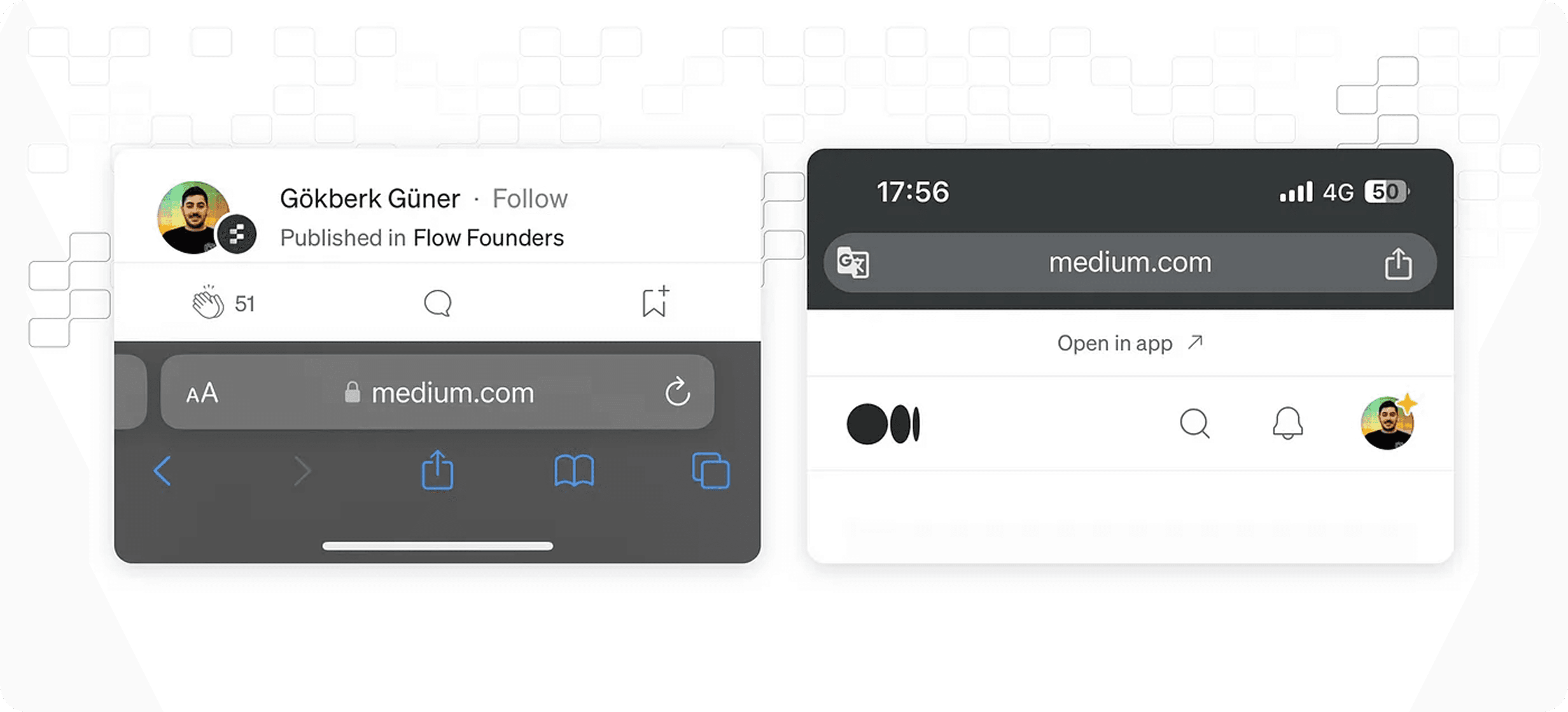
Apple’s Safari browser places the search bar at the bottom of the screen, ensuring easier reachability. Additionally, its swipeable tab design enhances accessibility.
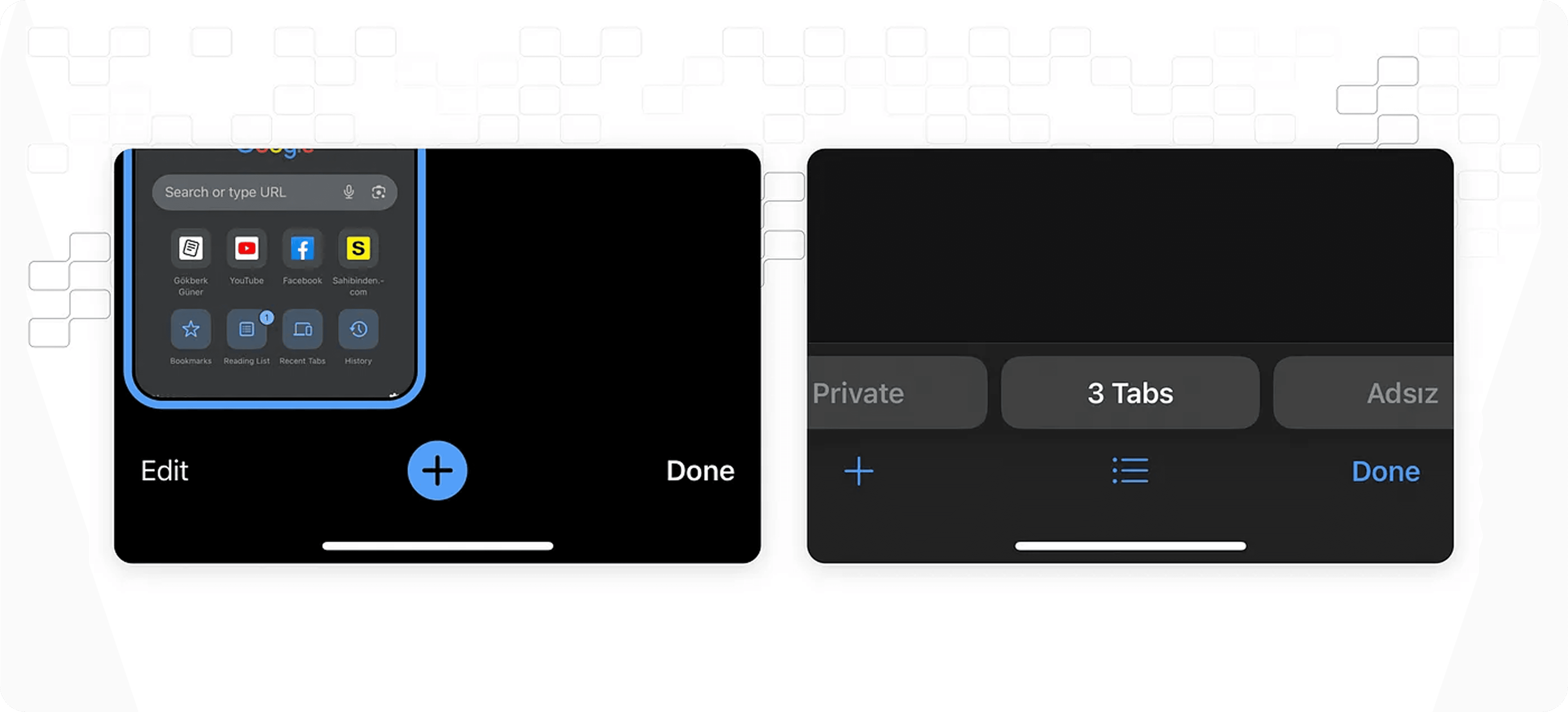
In contrast, Google Chrome’s search bar remains at the top of the screen, requiring users to stretch their fingers, making one-handed interaction more challenging.
Conclusion
As smartphone screens continue to grow, some areas become more accessible than others. Designing with the “Thumb Zone” in mind allows UX designers to create more user-friendly and accessible experiences. Understanding how users interact with their devices is essential in ensuring intuitive and ergonomic designs.
Next reading
Rating Pop-ups: Good or Bad?
4 min read